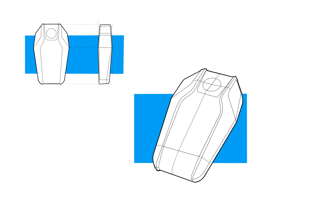
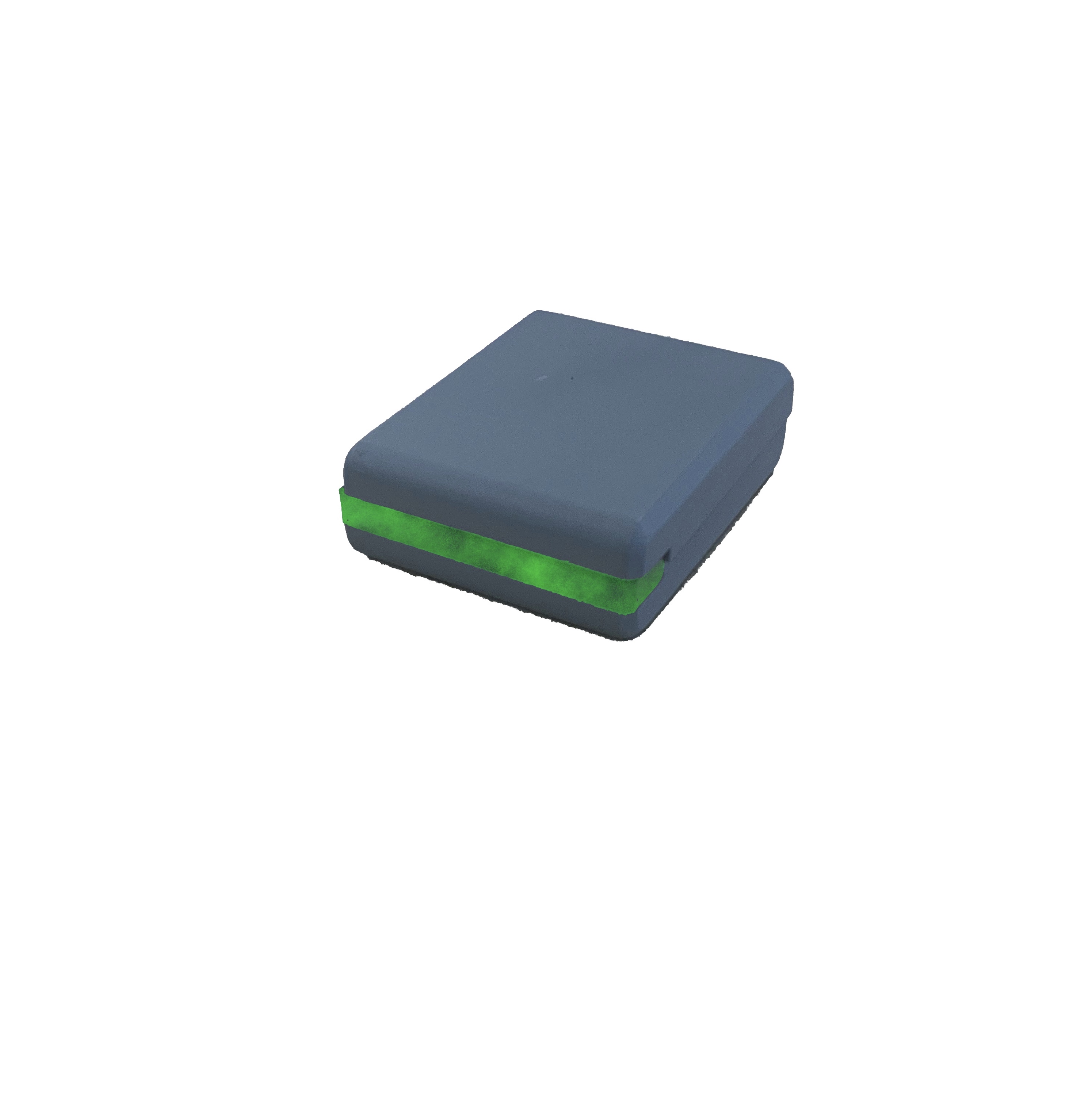
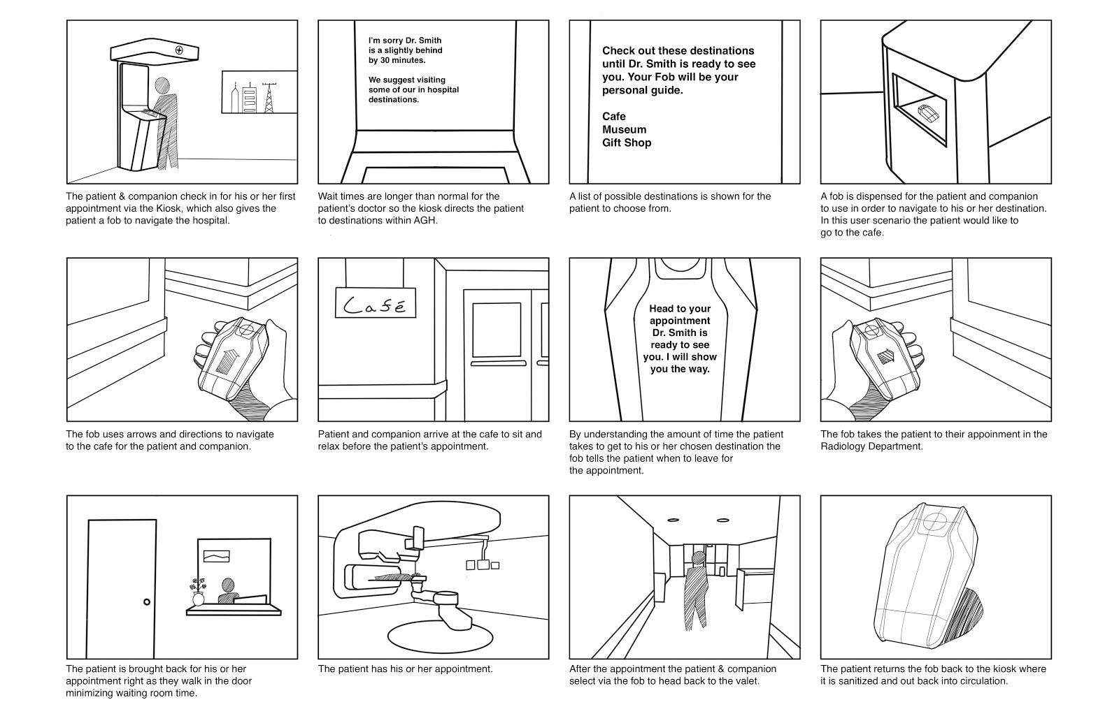
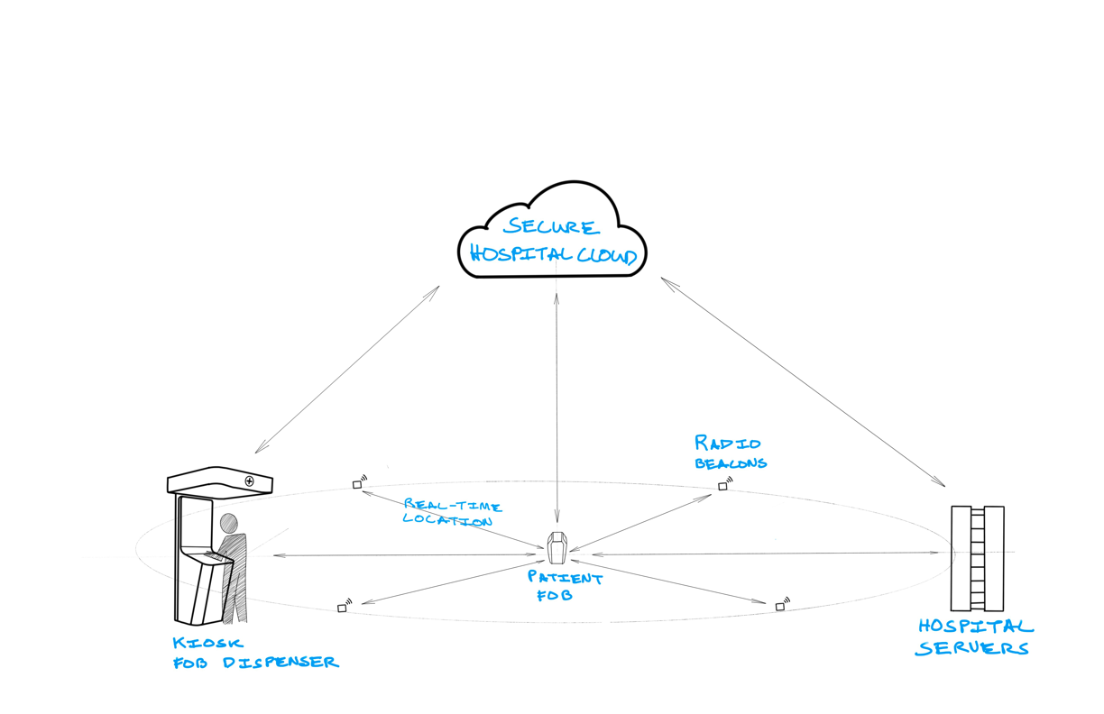
Complete documentation of the physical and digital prototype along with a video walkthrough is available through the following link:
Outcome
Cancer claims more years of life than any other disease. It lead to 38 million oncology visits per year in 2005, and that number is projected to rise to more than 57 million visits by 2020 (https://www.ncbi.nlm.nih.gov/books/NBK215252/). Those hospital visits take an enormous amount of time, and a majority of that time is spent waiting. According to a 2017 study from the Journal of Health Care Organization, the average hospital visit is 168.3 minutes, and 150.5 of those minutes are spent waiting for only 17.8 minutes of care. There is a huge opportunity to innovate in hospitals to not only reduce unnecessary wait times but also to enhance and embrace the necessary ones.
At Allegheny General Hospital (AGH), two-thirds of patients enter the hospital with one companion. The patient and companion navigate to their particular hospital wing, check in at the waiting room and then wait for the appointment to start. This wait can be brief or protracted depending on a huge variety of factors and can inject a lot of unnecessary stress into the experience. They are stuck in the waiting room until they are called, and have little more than “a few minutes” to guide their expectations.
Once the patient goes in for their appointment, the companion is often left to wait until the appointment is over. A lot can happen between drop off and pickup, and the companion also feels trapped in the waiting room because they do not know exactly when their loved one will be finished. The worst thing to happen would be to miss the time when their loved one comes out.
So, stuck in the waiting room, they wait. They read, fidget, pace, and sit. But looming over their heads is the worry that if they leave even for a minute, that they will miss something important. What if the nurse comes out with an update? What if my loved one finishes early? What if they need me? With all these questions unanswered, they stay and wait.
Problem Statement
Patients and companions spend more than three quarters of their time at the hospital waiting for treatment. This experience is marred by feelings of inefficiency, powerlessness and unknown as they sit trapped in the waiting room. How might we reimagine the waiting experience to both reduce time spent waiting and to embrace the necessary wait times in a humane and empathic way?
Proposed Solution
We propose an Internet of Things (IoT) ecosystem consisting of handheld fobs and check in kiosks that will reduce wait times by streamlining the check in process while freeing the patients and companions from the waiting room, reframing the waiting process as an opportunity to explore and enjoy other destinations throughout the hospital.
Recommendations and Next Steps
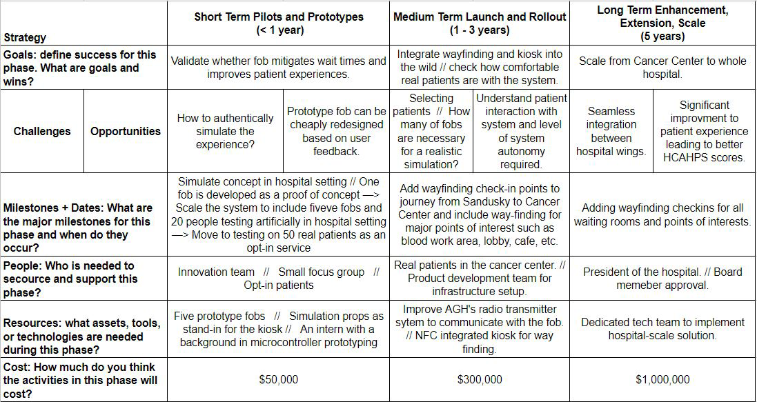
This system is sufficiently developed to begin small-scale concept validation. There are a few key places in the journey that need validation and testing, and the fob that we have built can achieve those goals. First, we need to understand how intuitive the fob is and whether patients will be able to remember that green means leisure, yellow means head over, and red means your appointment is ready. Restaurant buzzer systems have stickers that say: “When the pager is vibrating and the lights are flashing, your food is ready to pick up.” Perhaps something that simple and low-cost will suffice, or perhaps an e-ink display to dynamically update relevant information such as wait time and location would be worth the extra expense. Testing will help reveal which direction is the most promising and worthwhile.
Another aspect of the journey that requires validation and testing is the patient perception of the signals. Will patients listen to the yellow signal or will they actually start to head to their appointment only when the red signal starts? How will the timing work for when to send yellow versus when to send red? If patients notice a difference in signaling versus reality (for example, if their fob buzzes red but in fact no one is there waiting for them yet), then the system will not be trusted. Early testing of patient behavior and response to the buzzer signals will help create a more robust and reliable system that patients will enjoy using.
A third target for short-term validation and testing on the patient side is whether or not patients will even want to wait in other destinations or whether they typically arrive in such a way or have certain constraints such that visiting other destinations does not work for them. Due to HIPAA we were not able to do extensive user research on actual hospital patients Allegheny General, so it is possible that, even though us as able-bodied young people would love to wander about the hospital relying on a fob, perhaps less mobile, older patients would be less inclined to behave that way.
One general recommendation that we believe can have a large impact for a relatively small price is to incorporate themes into the landscape of the hospital. It is well documented in the field of experience design that utilizing themes in the design of spaces and experiences can significantly improve satisfaction and engagement. A classic example is Disney’s Rainforest Cafe. Rather than conform to the mold of overpriced amusement park burger and pizza place, the Rainforest Cafe creates a magical and wonderful experience quite literally around a watering hole. Now, eating lunch is a destination in and of itself that is desirable and fun, rather than a necessary break from the rest of the park. Another example closer to home is that children’s hospitals do a phenomenal job creating environments that make their patients feel at ease and relaxed. They decorate the rooms and provide entertainment and comfort throughout the patient experience. Everything is geared towards giving the children the best experience they can have while at the hospital.
We are not proposing that Allegheny General Hospital transform itself into an amusement park or into a children’s hospital. However, we must ask ourselves why we do not take care of our adult patients in the same empathic way that we treat our children patients. Why not create a rich and engaging atmosphere for adults when they have to go to the hospital? Allegheny General is an old hospital with a lot of different and conflicting styles. This is understandable given that it takes up an entire city block and was not designed from the beginning to be a hospital. We can actually use this heterogeneity to our advantage and lean into the differences by creating distinct themes throughout the hospital. This can help improve patient experience in a number of ways. First, the sheer delight of entering themed spaces on their own is not to be underestimated. Secondly, it can help a lot with wayfinding, where patients can remember where the Greco-Roman section was and more easily find it by passing through the forest section. Finally, it can help create more enjoyable destinations as the various existing destinations at Allegheny General lean into the themes in their respective locations. A cafe in the theme of a beachside resort would be a welcome respite from the stress of surgery.
In the next three months, significant progress can be made on this project to move it forward in development. We suggest working in parallel to conduct user research using the fob that we developed and to work on developing version 2 of the fob. Version 2 should be designed with scale in mind. A low-cost system designed to accommodate radio signaling, RFID scanning, and audio-visual feedback. The hardware we used for version 1 is general hobbyist equipment and great for first-cut prototyping, but not for large-scale development. Results from the user feedback can inform the design of version 2, but user feedback does not have to be complete before development of version 2 can begin.
You can upload files of up to 20MB using this form.
