Back to Parent

Outcome


Introduction

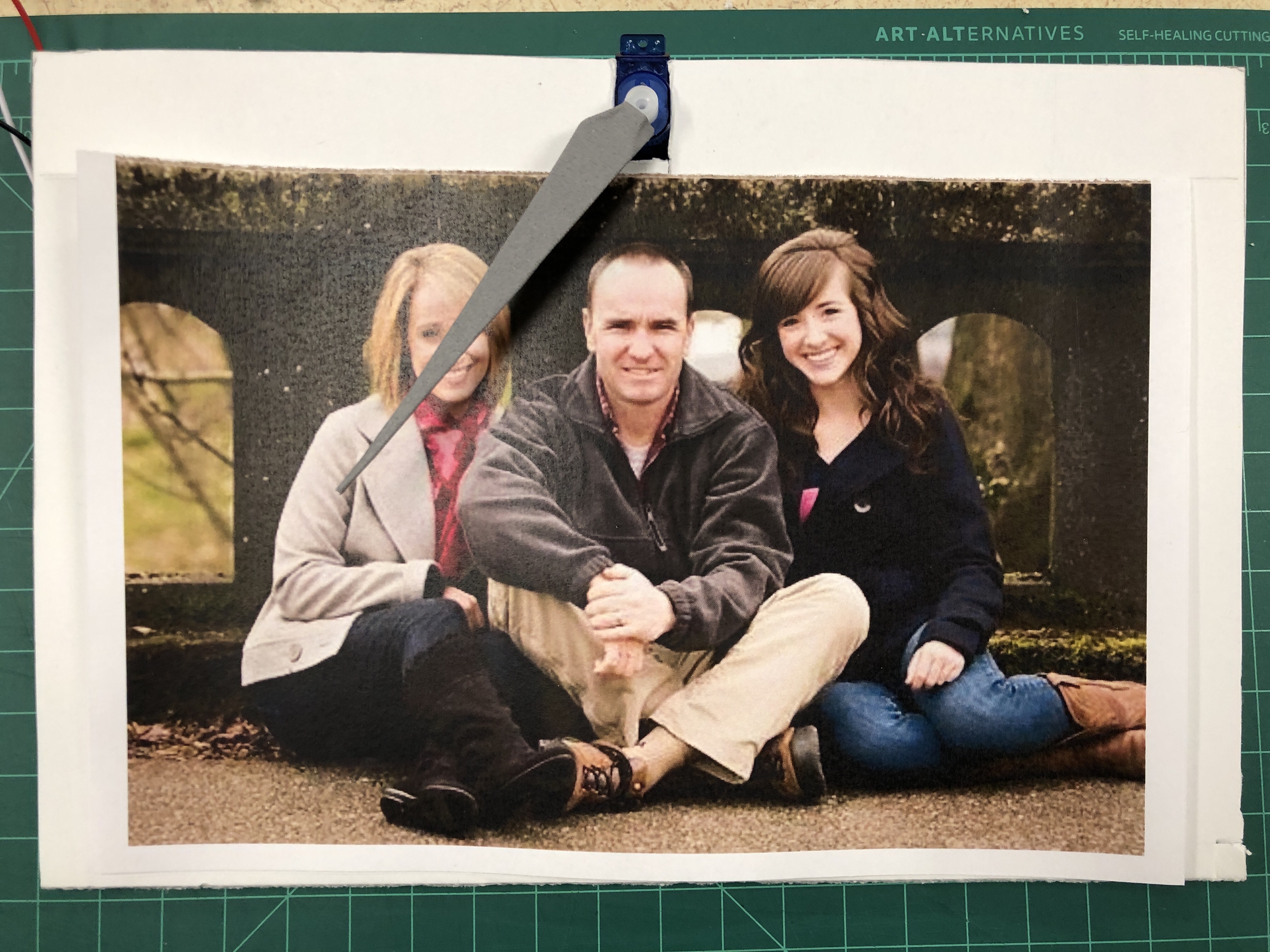
"Let's Catch Up" is an ambient photo frame which encourages users to talk to their families more often. It includes a photo frame, a love pointer, and a capacitive touch sensor (circuit). 

By default, the lover pointer hides behind the photo frame, and it starts to run after users' last call with their families. The longer they have not called, the faster it goes. The increasing movement leads to a hard time seeing the family photo that is been placed in the frame. The sense of urgency impels users to realize their ignorance of their families. By tapping the side of the photo frame, the family in the distance will receive a "Let's catch up" text. The initiator's pointer also stops right after because we want to remind users that planning to call does not equal to actual calling, and the pointer goes back to the default hidden location and restarts after the family responds to the text. 


** 

As international students ourselves, we want to design a product that can connect families members who live far away from each other. We have learned from domain research that there are many products in the IoT market targeting long distance emotion/feeling sharing, and we would love to build upon those and add a call-to-action. 

Inspiration from previous works:

1. Ishii's LumiTouch photo frame
2. Proximity Lamp Using Arduino
3. IoT Location Sensing Picture Frame
Final Design

Show Advanced Options
Img 4546
Show Advanced Options

Feedback from Version 1, 

"Missing U" (the initial prototype)

  • The touching/LED-lighting-up interaction is kind of strange. People think it can be scary when a photo lights up randomly.
  • The idea is really similar to Ishii's LumiTouch photo frame. 

Process

1. The initial prototype was intrusive, and the idea has been out there for many year, so we started with another round of ideation. We still like the family connection concept, but this time we looked into how to make users take actual actions by using our product, such as sending cute messages, calling.


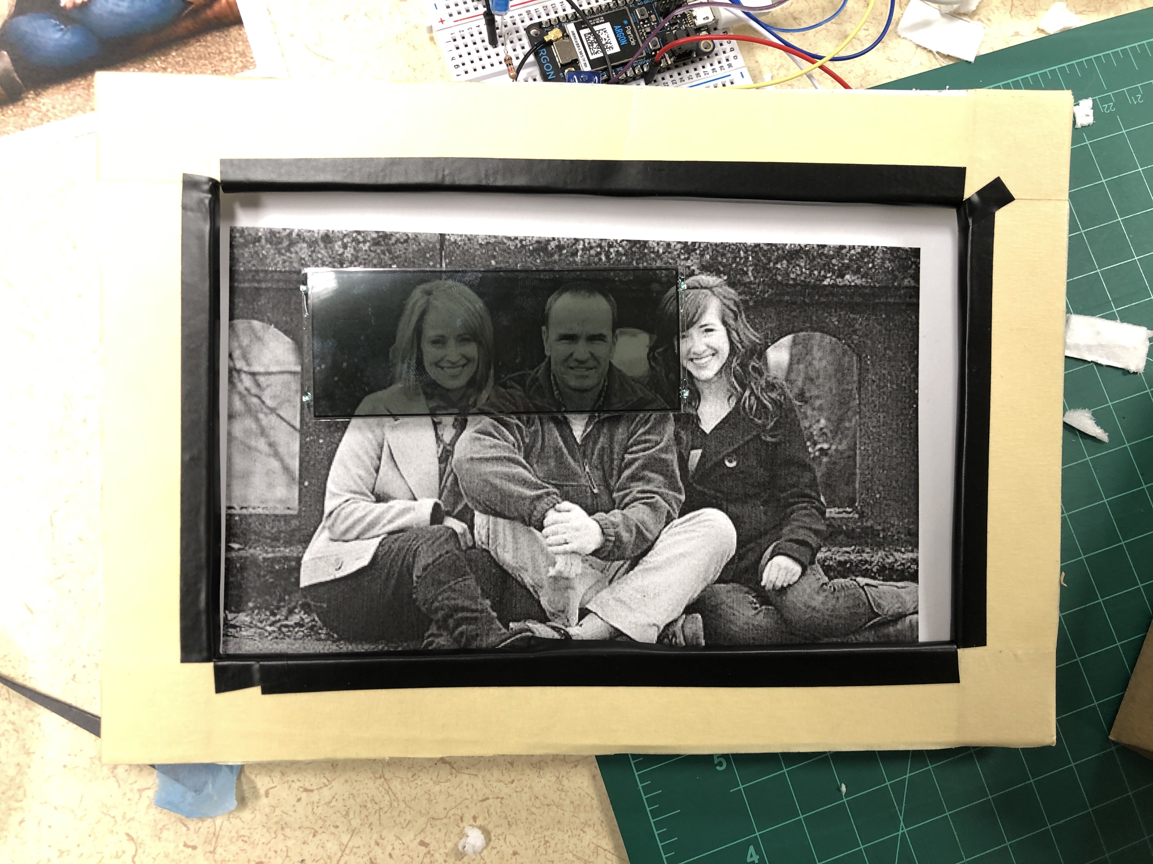
2. After deciding the direction (texting), we started brainstorming what the interactions should be and how we can show the interactions. Because we want users to take actions, we want to create a sense of urgency. Sijia suggested it will be interesting if the family picture gradually disappears when people have not talked to their families for a while. We tried LCD first. Though it looked fancy, it was too small compare to our frame, and its rectangle sharp shape looked intrusive. 

Img 4544
Show Advanced Options


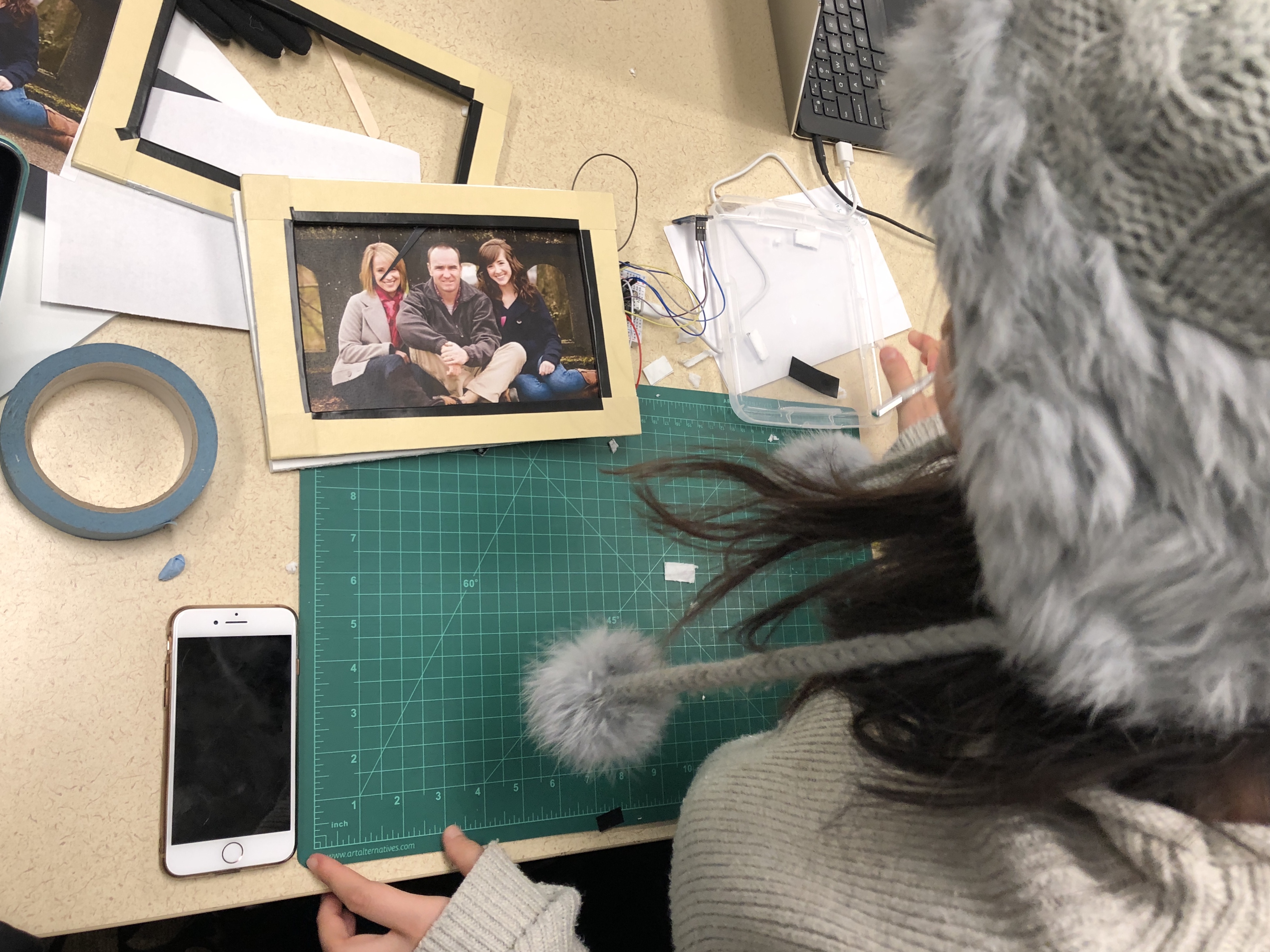
3. Then, we went back to a more traditional way, adding a stick in between the picture and front frame to interrupt people looking at the picture.    

Img 4515
Show Advanced Options


4. We also wanted to incorporate the capacitor section we built before, so we quickly storyboarded how the entire interaction will be. We connected it with IFTTT to completing the responded interaction from the other party. 

Img 4505
Show Advanced Options
   

 5. We tried different kinds of "love pointer" design.    

Img 4543
Show Advanced Options
Img 4545
Show Advanced Options

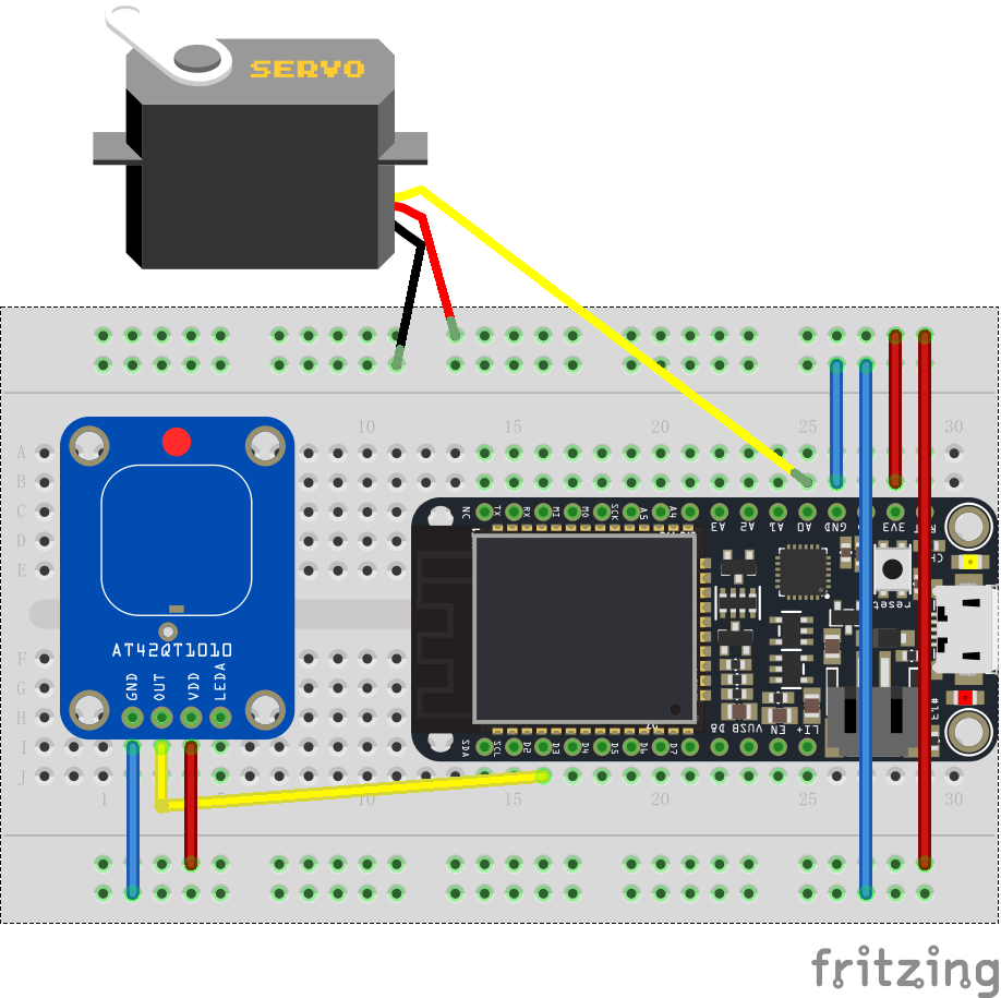
6. We also started working on the code and circuit design, exploring ways to make our ideas come alive. 

Bill of Material

  1. Argon x 1
  2. Breadboard x 1
  3. Capacitive  touch sensor x 1
  4. Servo x 1
  5. Wire Jumpers 
Circuit
Show Advanced Options

Next Steps

1. The way of reminding people to connect with family members can be more ambient and intuitive - photos could fade off or disappear as time passes by.

2. Currently, we have only connected IFTTT and the initiator (people who reach out first). For the next step, we should connect both sides.

3. The devices are connected with only the text at the moment. We can incorporate social media into part of interactions.

Feedback from Tue. Presentation

The guests gave us some really insightful feedback in areas we have not thought about at all. Some of the things we learned:

1. Think about the design intention. What emotion do we want to bring to the users? Do we want to make them feel guilty about forgetting to talk to their families or do we want to create happiness for them?

2. Think about the target users Guests suggest us to be specific about our target groups since they see gaps between their understanding and our descriptions. It will be better for the work and presentation if we have a specific persona in mind. 

3. Think about the ethics issue the product might bring to the users. Though it is designed with good intentions, we need to be careful about the level of stress we unintentionally add to the users. 


Drop files here or click to select

You can upload files of up to 20MB using this form.