Back to Parent

Outcome


Intention

The primary goal of our project is to create an environment that encourages interactions among strangers in public spaces.

One such space we identified is the bus stop. It is a place we visit multiple times every day. Most of our time is spent waiting for the bus. It can be very frustrating as it feels like a waste of time. However, it is unavoidable. While waiting for the bus, we encounter the same people almost every day, yet we do not interact with them or even acknowledge their presence. Instead, we occupy ourselves with our phones to avoid eye contact or any type of interaction.

Our project aims to transform solitary waiting at bus stops into a collaborative and engaging experience through game-play and ambient light.

Community

We are focusing on the community of bus users in Pittsburgh. More specifically the familiar strangers we encounter while waiting for the bus.

"Familiar strangers are people that we regularly observe but never interact with." - Stanley Milgram (1)

Unlike people that we know and the others who are complete strangers we encounter once and never see again, familiar strangers are somewhere in between. "You know each other - even if you don't really know each other." (2) With the people that we know, we are bound through social reciprocity; and with complete strangers, no such bond exists. However, with familiar strangers, since we encounter them regularly in familiar settings, they establish our connection to individual places (3). The relationship we have with familiar strangers is indeed real wherein both parties mutually agree to ignore each other without any implications of hostility.

Through our project, we aim to explore how might we break this pattern of ignorance to create a positive experience by facilitating interactions among this group of people in a non-intrusive way. We want to make people more aware of each other and their environment.

Some of the points that we must keep in mind while designing for this group of people are:

  • How might we generate interest among these people?
  • How can we create a safe space where people come forward to interact with the system and one another?

Inspiration and Context

Some of the projects that acted as inspiration and a guide for our project were:

21 Swings:  A musical installation in Montreal that plays certain melodies only through cooperation between the users. Thus, creating a sense of community and ownership of the space. 

Heated Bus Stop: A bus stop in Montreal that heats up when the people at the bus stop hold hands and touch the sensor to complete the circuit. Although it is a marketing campaign for Duracell, it spreads a positive message that "you are not alone". You are part of a much larger community and together you can spread warmth. At first, people look at the poster quizzically, but once they participate, you can see that they start smiling and have a fun experience while waiting for the bus.

Coca-Cola Friendship Machine: A tall vending machine that can be used only when people work together to reach the keypad. From the video we can see how the machine attracts a lot of attention, making people more aware of their everyday surroundings. Soon we see more and more people crowd around the machine looking at each other with surprise and broad smiles. We then see how people come together to buy soda from the machine. It shows how we can overcome any obstacle if we work together as a community and that no obstacle is big enough if we have each other. 

All these projects highlight how collaboration through a shared activity can bring people together even if they may not know each other, it has the ability to create a positive experience for people. Our project builds on this ideology. 

Show Advanced Options

Process

Our project started with the initial idea of wanting to make the CMU campus more lively. To create a space where students can relax and interact with one another. However, we wanted to share our project with the greater community of Pittsburgh and hence looked at other spaces. Once we identified bus stops as our creative space we moved on to ideating the experience.

Some of the themes that emerged from ideation were:

  • Interaction 
  • Collaboration 
  • Competition 
  • Exploration 
  • Safety 

Playing games was central to our idea since it facilitates interaction. While gaming can be competitive, we wanted to focus on collaboration as the primary method of interaction. We looked at the different ways in which we could incorporate the gaming experience at a bus stop.  

Since our idea revolved around collaboration rather than competition, we looked at ways in which people could come together to light up the bus stop stand with their combined efforts. We considered having bus stops light up differently across the city to reflect the character of the area and promote exploration. We also considered interactions between bus stops on opposite sides of the road. In all these instances, we faced a few challenges. 

  • How can we make it intuitive?
  • How can we clearly and easily communicate to the user the functionality of the system/game?
  • How can we make it interesting for the user to want to interact with our system not once but multiple times?

Our final concept design takes these challenges into consideration and works at creating a system that facilitates interactions in an intuitive, engaging and simplified manner.   

Conceptual Design 

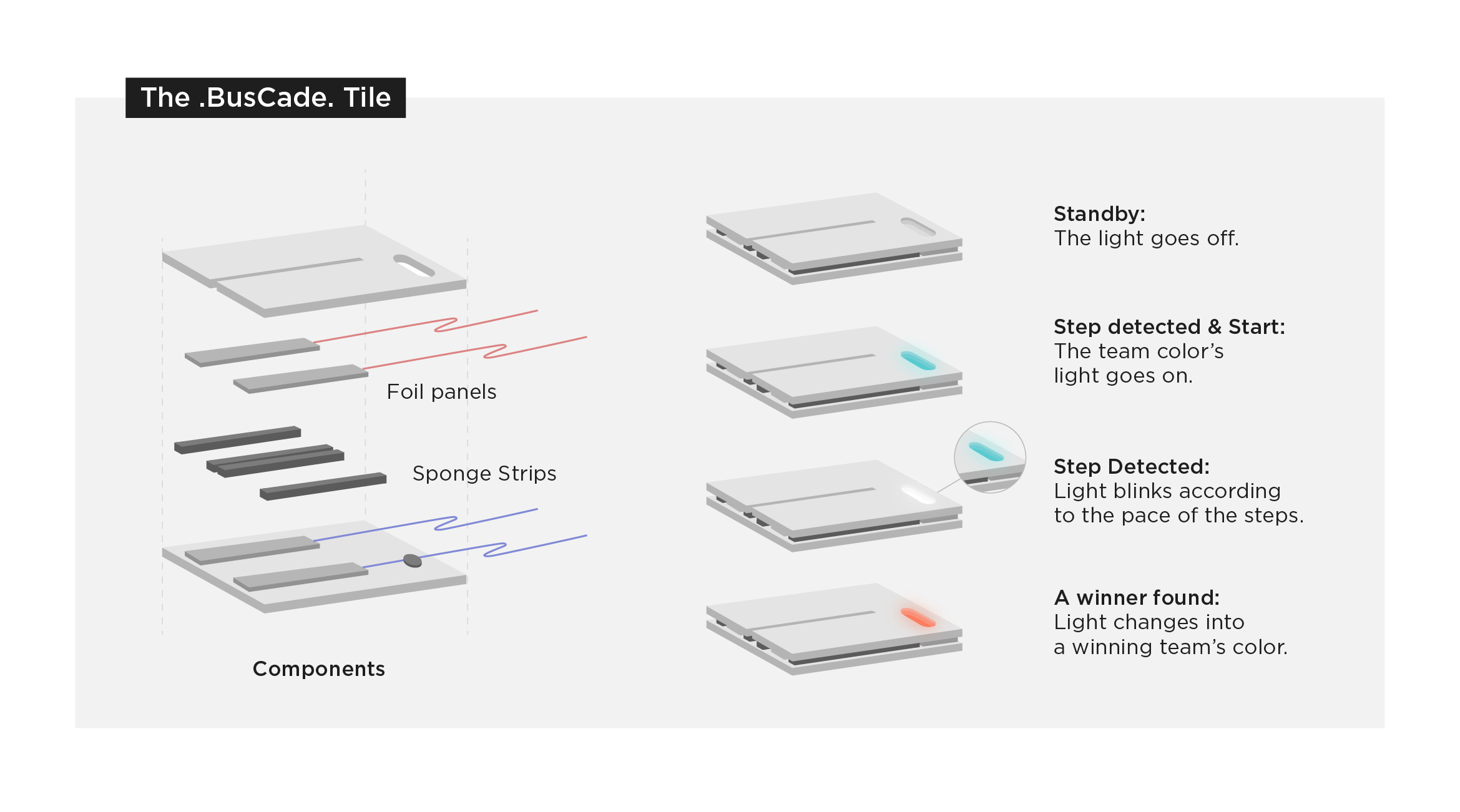
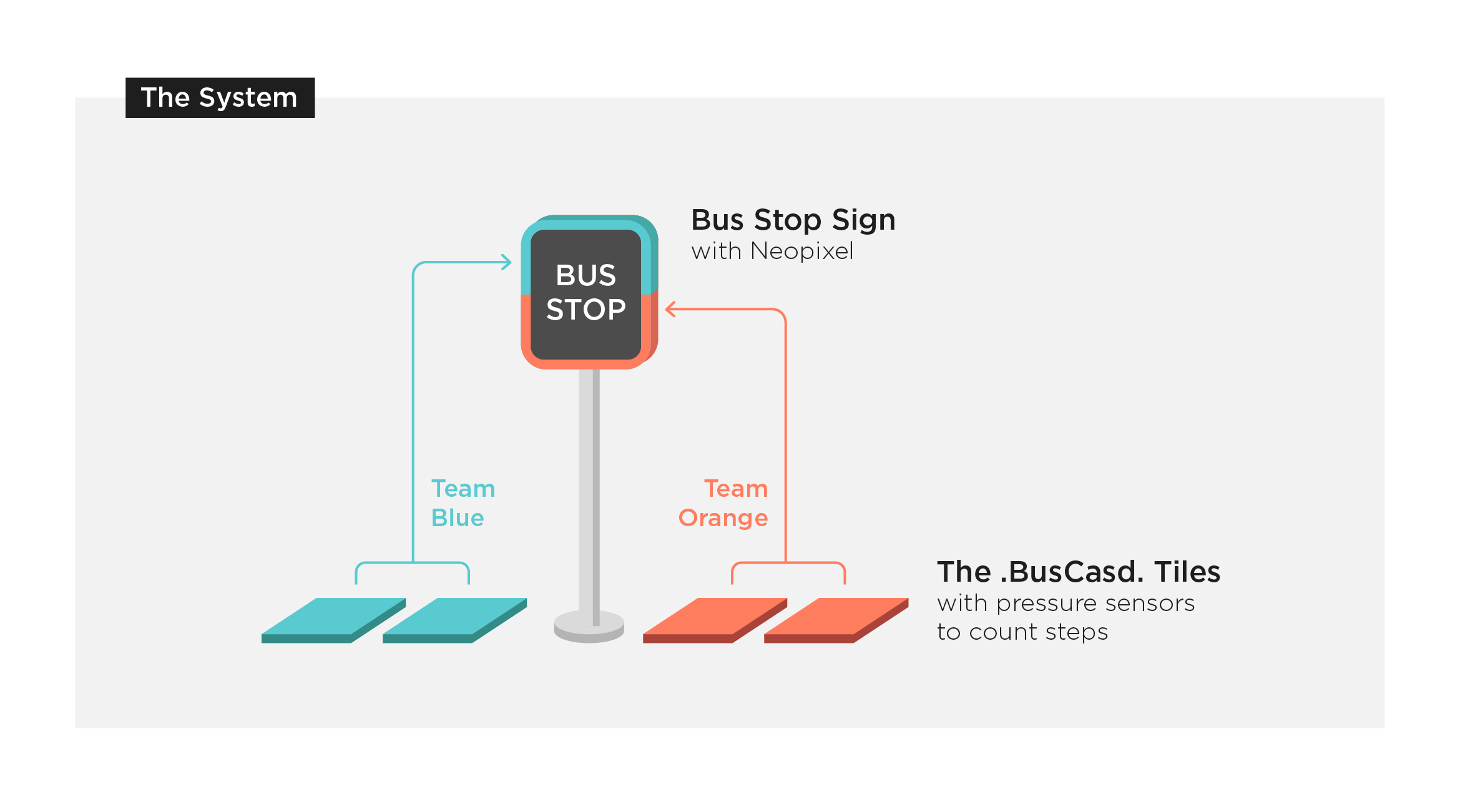
Our system is installed at the bus stop, it comprises of an enchanted bus stop sign and multiple tiles embedded into the floor around the stand.

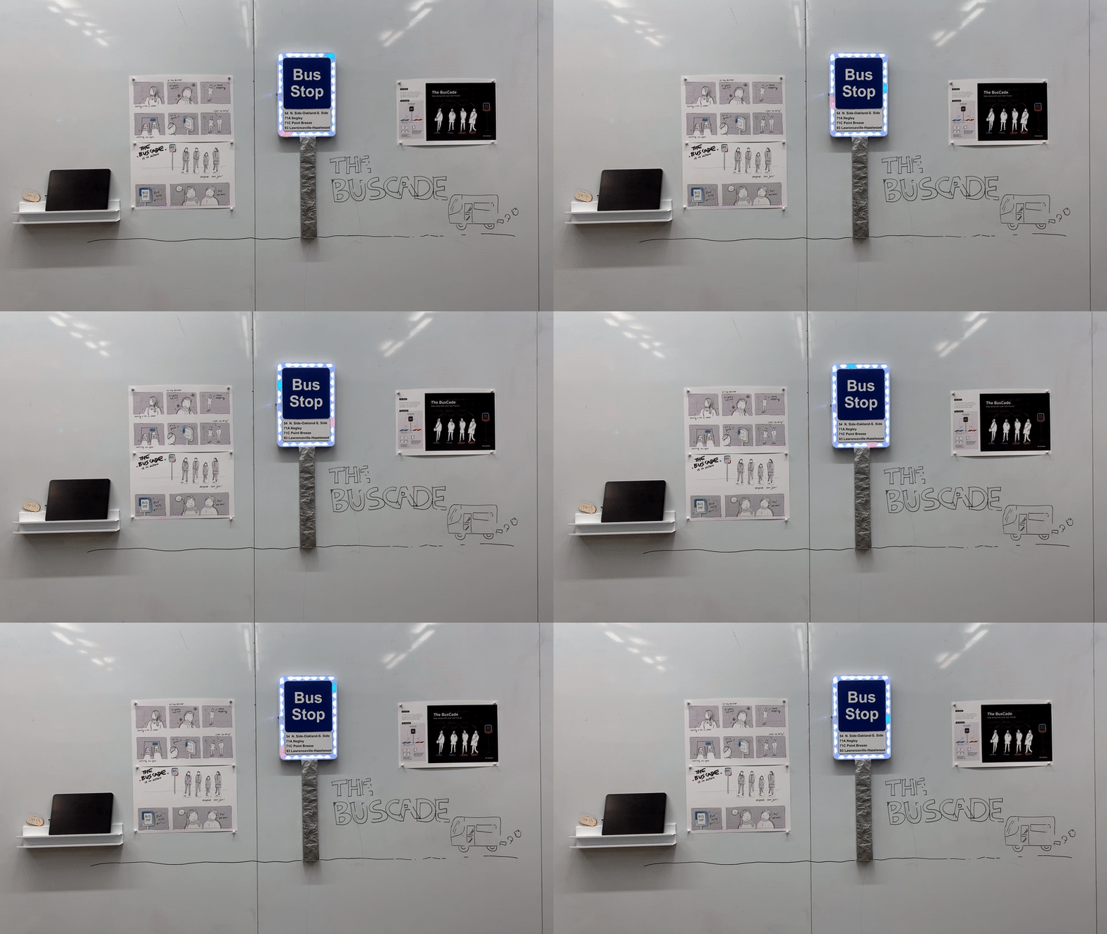
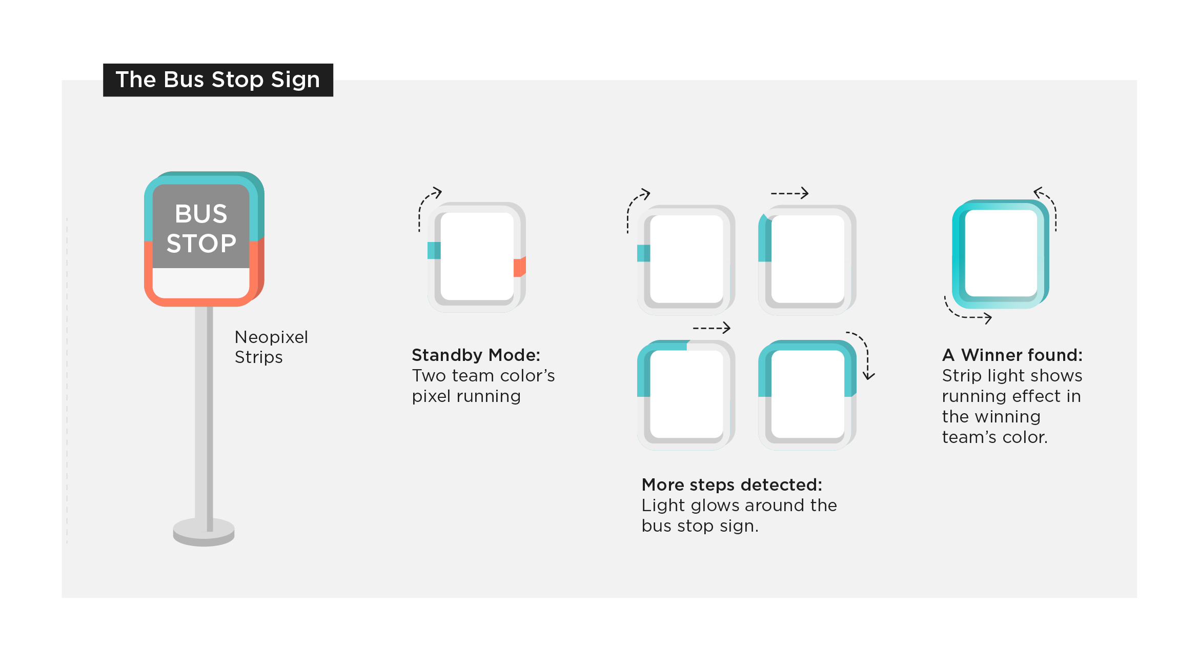
The sign is wrapped with LED lights to create an ambient effect. In its resting state, it glows white with two dots, one blue and one orange, running through it.

The tiles have footprints on them to indicate that the user must step on it. It ties into the fact that if there is an outline of a foot, it is a human tendency that we want to put our foot on it/stand there. This makes our system very intuitive. Once the user steps on it, the panel will glow either blue or orange to indicate the user's team color. At first, they may not fully understand the meaning of the color but it registers in their mind that they are either orange or blue.

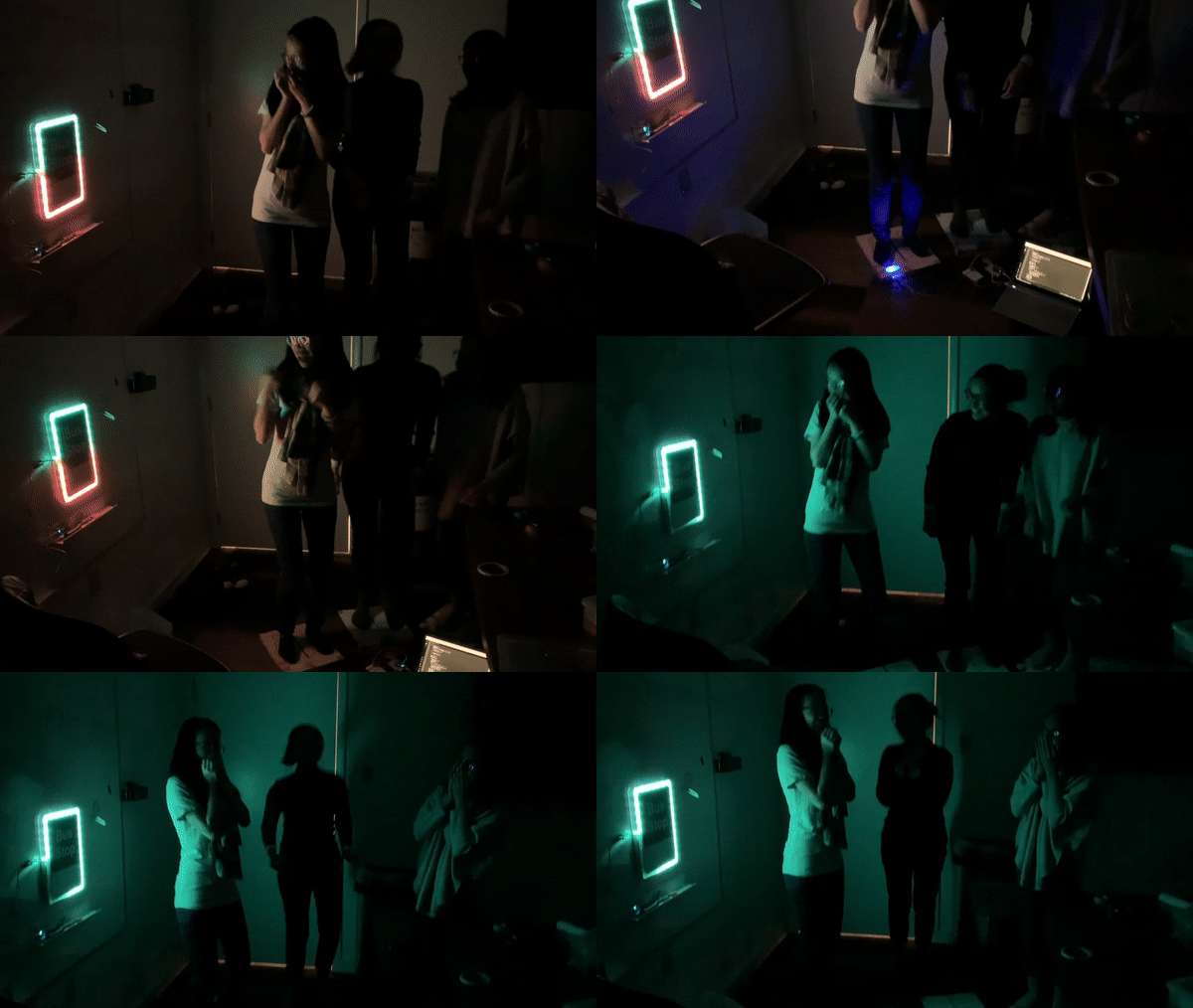
The user then starts to move from foot to foot as a natural behavior. This prompts two changes to take place simultaneously. Firstly, the panel on the tile will start blinking based on the movement. This encourages the user to keep moving to try to discover what is happening. Secondly, the bus stop sign glows white and shows the points for each team in the form of LED lights glowing in the team's color. As the user increases the pace of their footsteps the LED count grows until a team wins. Having the team color on the tile seamlessly allows the user to make the connection between the color on the tile and sign.

When either team wins, the entire bus stop sign displays the winning team's color in a running pattern. 

Diagram 10
Show Advanced Options
Diagram 11
Show Advanced Options
Diagram 09
Show Advanced Options

Storyboard

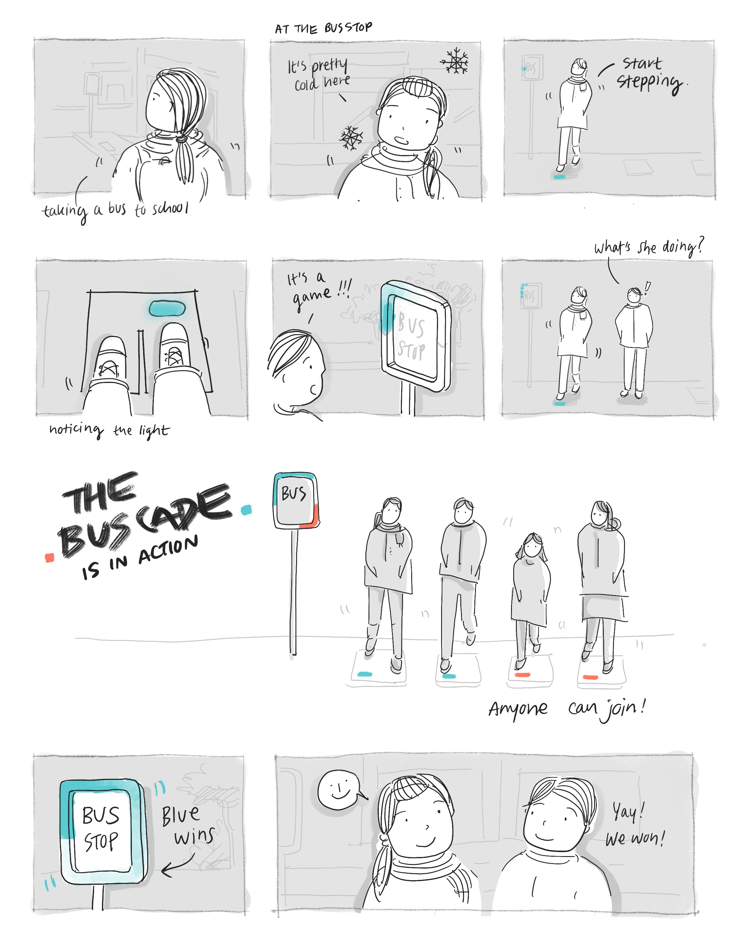
The storyboard below shows the contexts and how community members interact with the BusCade.

Storyboard
Show Advanced Options

Prototype

Prototype version 1.0:

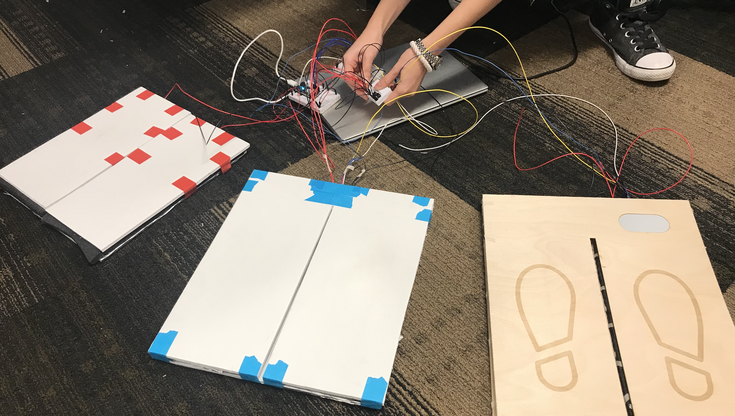
Initially, after considering FSR (too unstable) and the push buttons (too fragile) as the sensors to be implemented in the tiles at the bus stop to detect motions of the bus riders, we decided to use pairs of panels covered by aluminium foil instead.

To test if the idea would work, we built a quick first prototype using cardboard and aluminium foil:

A018ef56 546b 4d29 bd3f cd0f8d576417
Show Advanced Options

Prototype version 2.0:

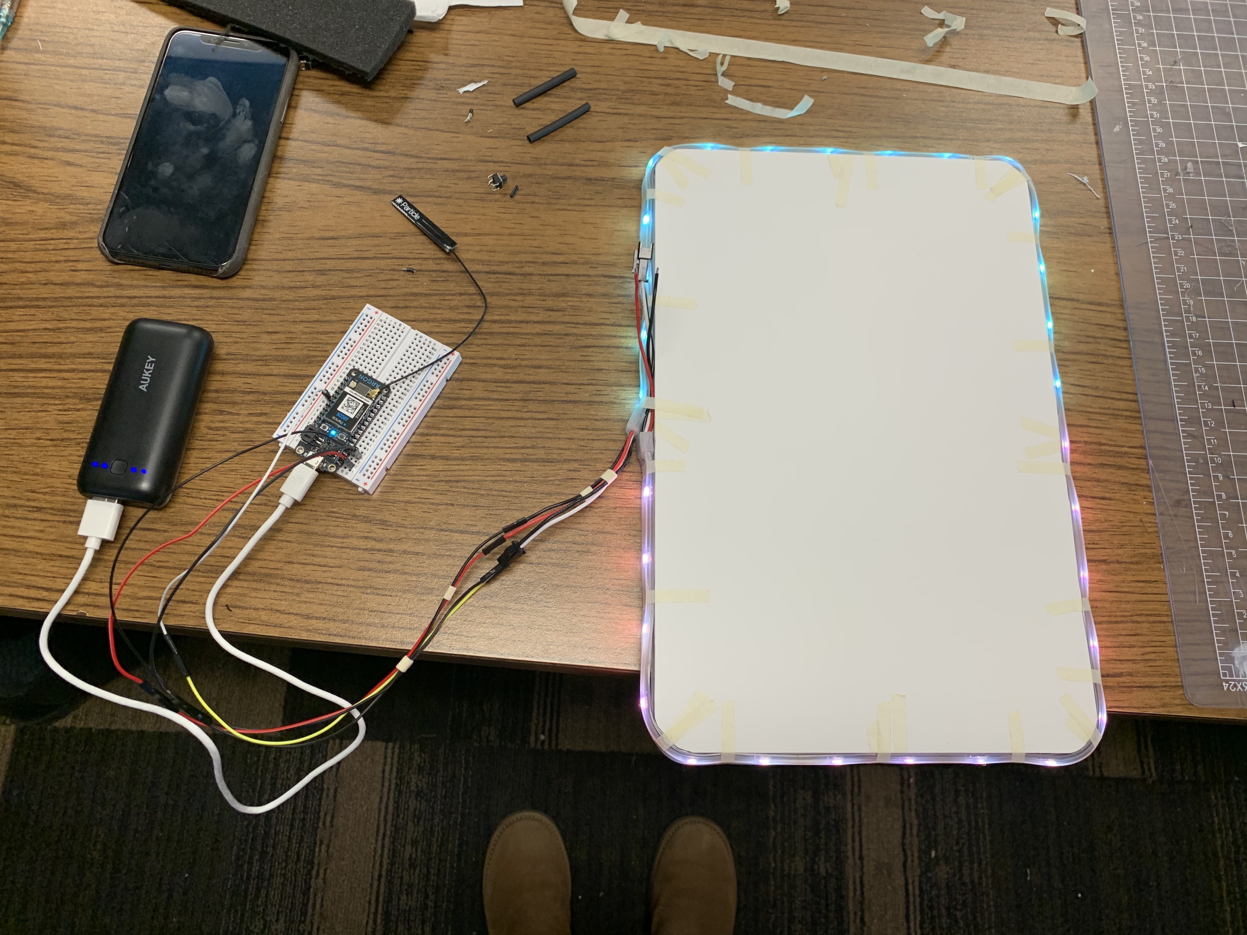
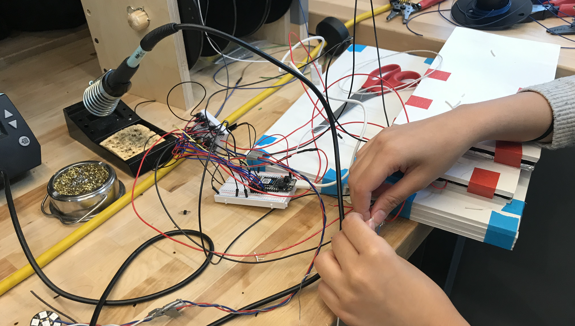
Since prototype version 1.0 worked out, we proceeded to build a set of tiles with foam core boards and also prototyped the ambient bus stop display to communicate the status of the game-play. 

We tried several combinations of the signals used on the ambient bus stop display and the colors to be used (while avoiding traffic signal colors.)

00b2ee1d d59a 4111 aee3 99035954c84d
Show Advanced Options
Img 1609
Show Advanced Options
Dbe46f5c 4c02 427b 9f5a 486cb0f53e83
Show Advanced Options
Screen shot 2562 12 12 at 22.34.55
Show Advanced Options
627255db e832 4564 b8bd 7376202f6c54
Show Advanced Options

Prototype version 3.0 (Final):

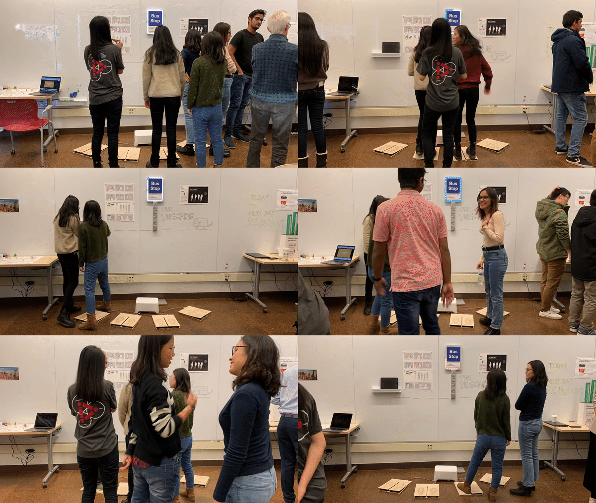
Using prototype version 2.0, we performed user testings and collected feedback from the TA and other teams.

Based on the feedback, we re-deigned the gamification part to make the rules clearer, aiming at communicating effectively with the user while remaining as non-intrusive as possible. And added the reset function so the game will automatically go back to the starting stage when it hasn't been stepped on for a while.

We also visited TechSpark for wood working to build more durable prototypes of the tiles.

Img 6056
Show Advanced Options
Cea73733 d99d 4dea a624 823e106394c6
Show Advanced Options
Screen shot 2562 12 12 at 22.35.34
Show Advanced Options
Ezgif.com video to gif %282%29
Show Advanced Options
Ezgif.com video to gif
Show Advanced Options
0712919f 1130 4a2f 8181 e0fbc2838603
Show Advanced Options

The key outcomes of the project are summarized in the following two videos:

Show Advanced Options
Screen shot 2019 12 11 at 3.49.18 pm
Show Advanced Options
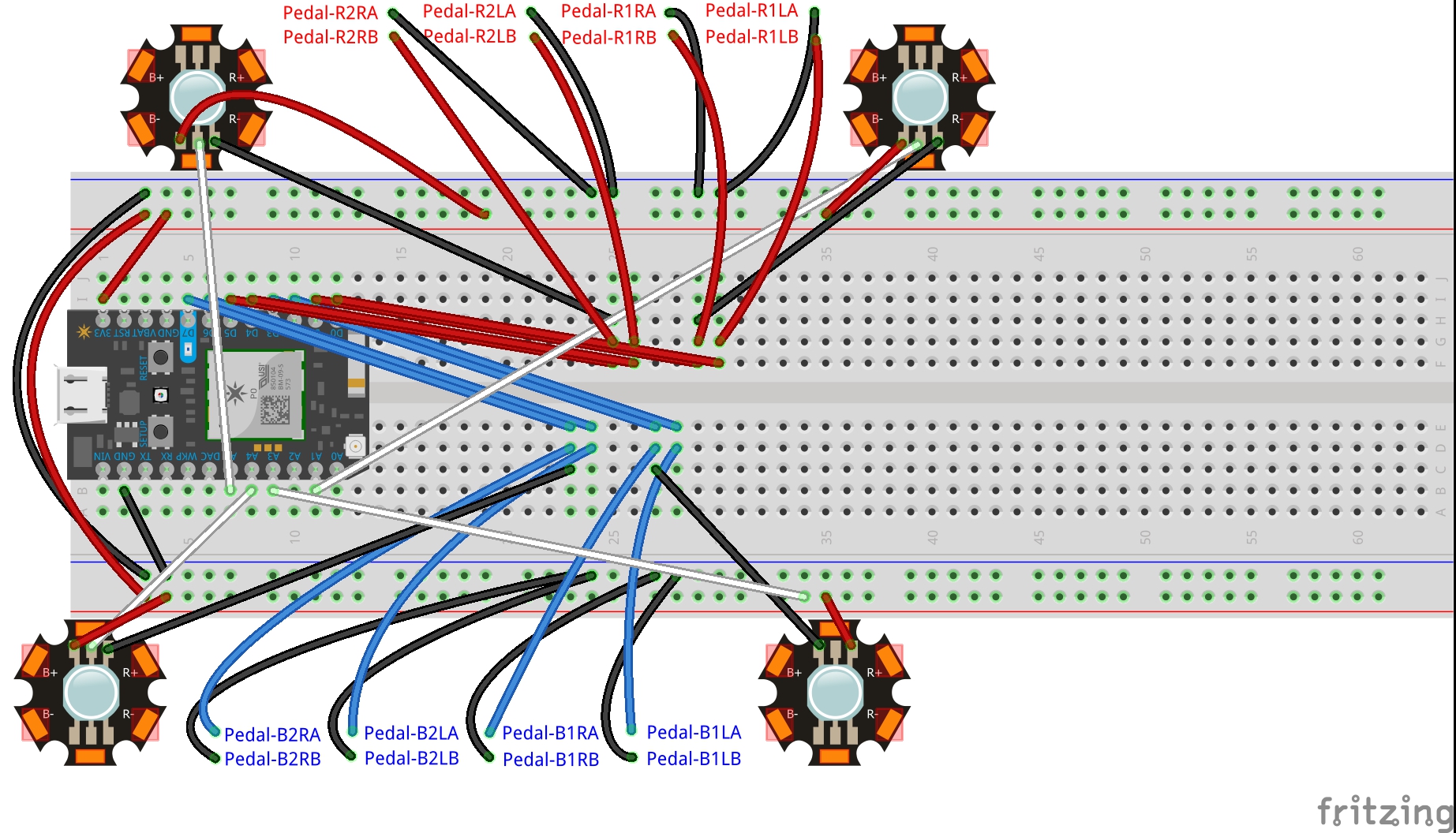
Pedals
Show Advanced Options

Some technical challenges we've encountered and overcame:

- To design and make the LED strip to display the game-play information in an effective and stable manner

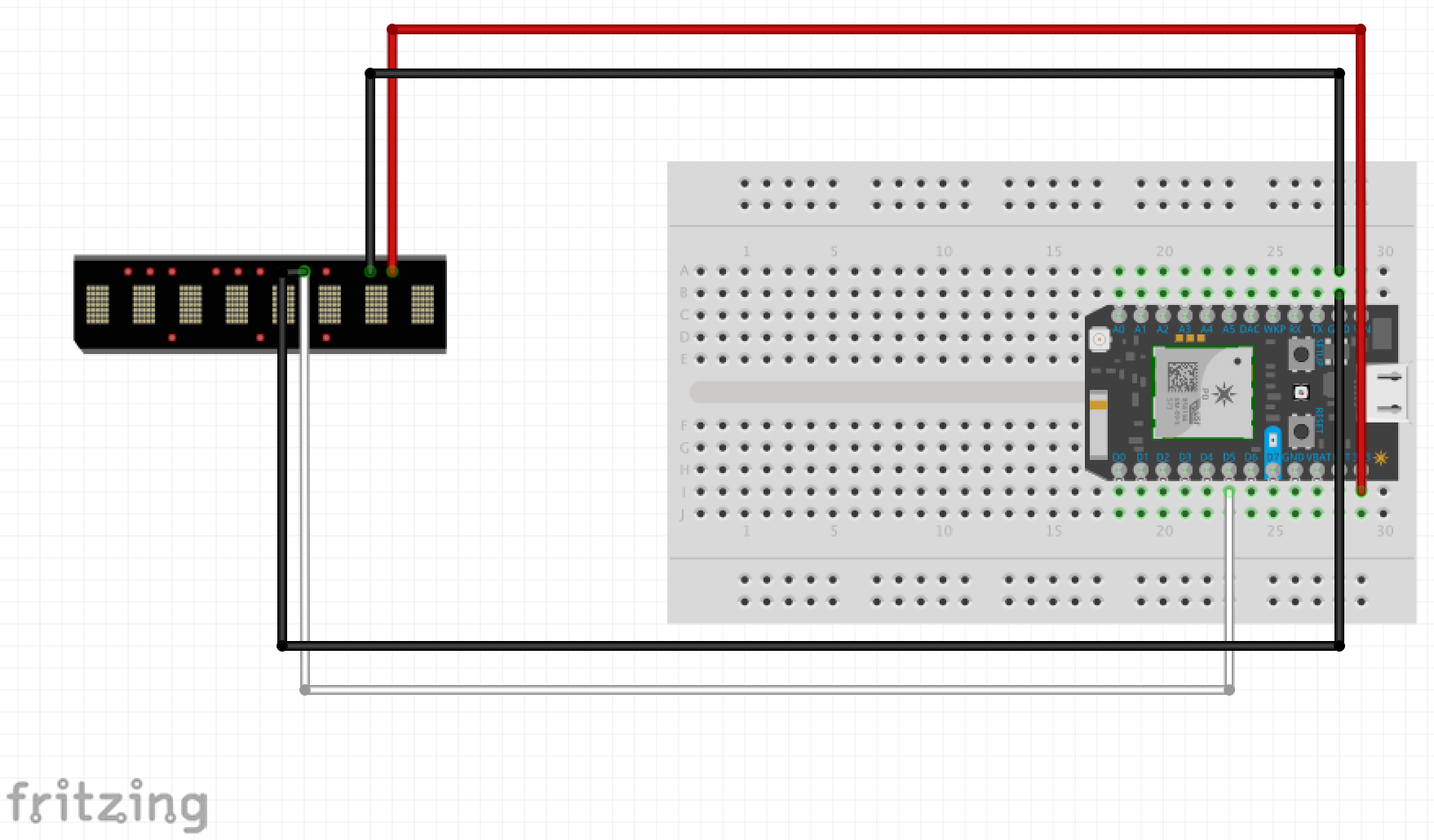
- To communicate the game-play information between the tiles and the ambient bus stop display via Particle cloud instantly and stably

- To build durable tiles for testing and demo purposes

- To organize the wire "jungles" in an elegant manner and hide the complexity from the users

List of parts used to build the final prototype:

- Particle Argon x 2

- Breadboard x 2

- Adafruit NeoPixel Digital RGB LED Strip - Black 30 LED (1m) x 1

- NeoPixel Digital RGB LED (circular-shaped) x 4

- Jump wires

- Aluminium foil

- Craft wood boards (1/8 inch thick)

- Foams (0.8cm thick)

- Foam core boards

- Double-sided tape

- Duct tape

- Medical tape (for the front panel of the ambient bus stop sign display)

- Acrylic sheets (clear)

- Power banks

Next Steps

If we were to take this project forward, we would consider the following -

Making the system self-sufficient - The current system is required to be linked to the power grid to function. However, on further development, we hope to use the energy generated by the user's movement to power the ambient light.

Inclusive - Our current design allows users to interact with the system by stepping on the tiles. This may prevent people with disabilities (e.g a person in a wheelchair) from using our system. Going forward we want to incorporate a design solution that would allow everyone to be able to use it without any limitations.

More varieties - While our current game is engaging, going forward we want to find ways in which we can keep updating the games to ensure that the system remains engaging over a longer period of time. We can consider having different games at different bus stops, different colors of teams etc. This will generate more conversations, motivate bus riders to explore more of the city, and encourage more citizens to use public transportation.

Larger surface area - At the moment we are using tiles as our sensors for the input. This leads to having only limited number of tiles and also limited surface area on which the user can stand. Going forward we envision that the sensors are embedded into the ground and there are no limitations of standing spots.

Materials - For the purpose of this project, we used materials such as foam boards, foil and wood. However, if this project were to be implemented in the real world, durable and weatherproof materials would be required.
Ezgif.com video to gif %281%29
Show Advanced Options
Img 7418
Show Advanced Options
Img 0288
Show Advanced Options
Drop files here or click to select

You can upload files of up to 20MB using this form.